HCA Healthcare
Due to confidentiality agreements most of what I worked on at HCA cannot be thoroughly discussed outside company walls. So instead, here are some high-level overviews of a just few favorite projects of mine. Craving for more info? Ask me!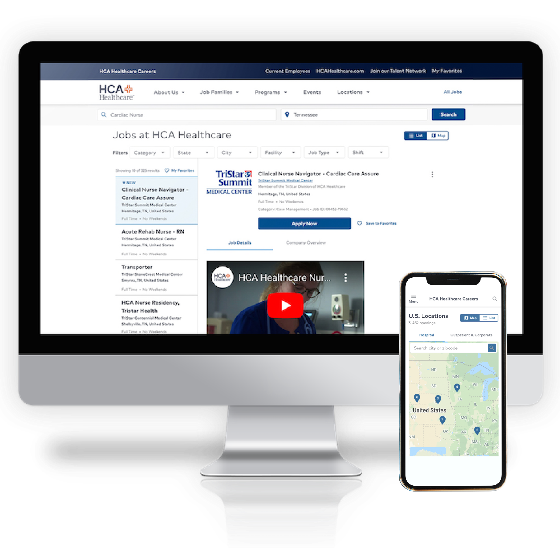
UX Research & Design
HCA Careers Site
Complete website redesign from strategy to architecture to voice to design. A thorough 7 months of creating a personable and engaging careers site for all potential HCA candidates.
View full case studyUX Design
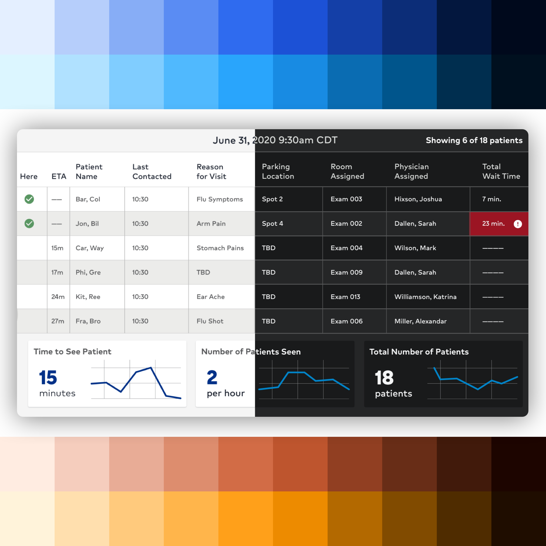
COVID-19 ESS Tracker
An application for resource tracking during the 2020
coronavirus pandemic. The recorded submissions had to be sent
in twice a day.
Challenge: An extremely tight deadline.
Continuously changing requirements with updated pandemic
mandates. A cohesive and automated design to improve
efficiency of the massive form that was filled out twice a
day.
Neutron Design system
HCA's Design System
Work alongside directors, managers, engineers, designers and
researchers to help advance and mature HCA's design system to
accommodate multiple platforms, showcase informative
documentation and translate the system into a viable code
library for corporate-wide implementation.
Challenges: Building framework-agnostic web
components, defining optimal documentation architecture,
component-centered research, brainstorming systemic solutions
within the kits and consulting with teams leveraging Neutron
throughout the company.
UX Design
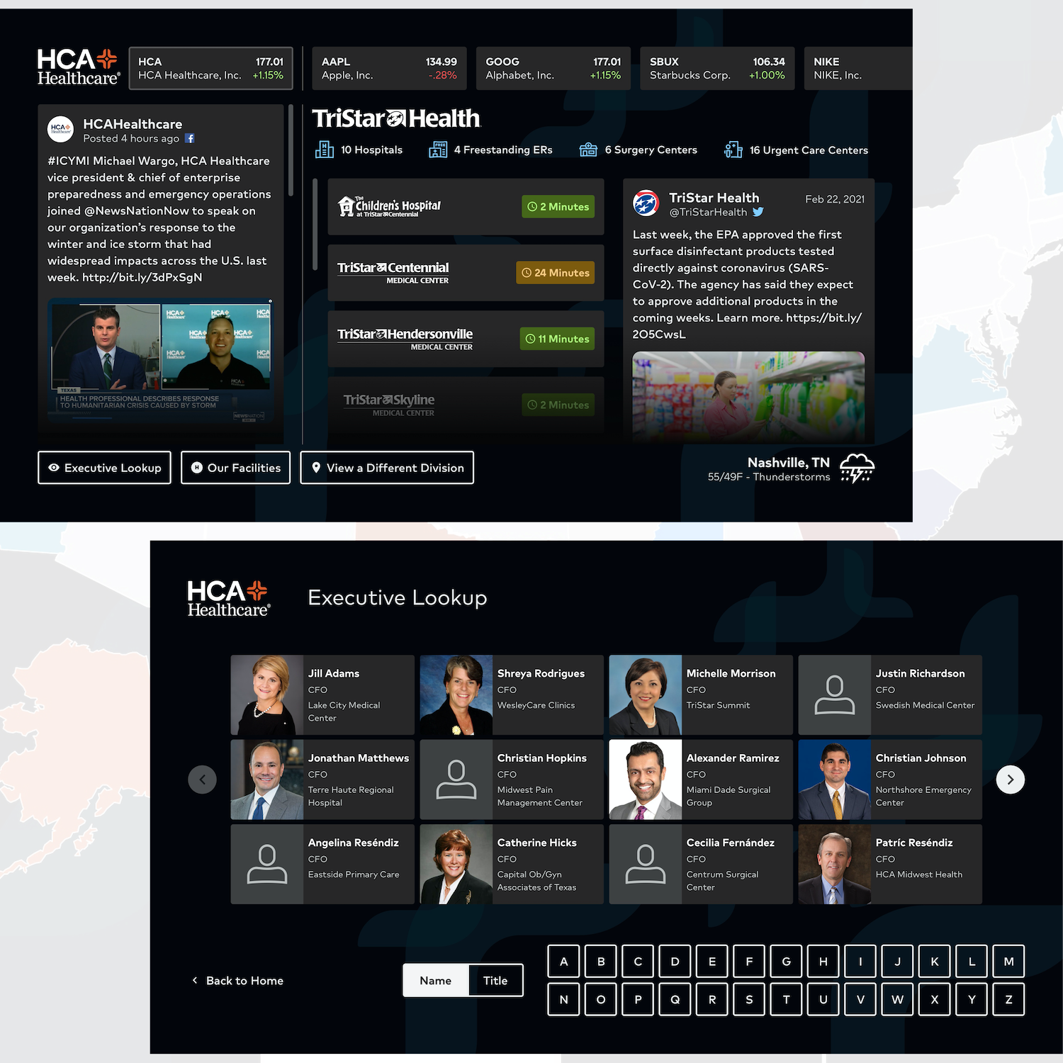
HCA Interactive
This executive-facing product is a large interactive touchscreen. It lets users scan the stock market, see division-centric social feeds
and search for executives and facilities within a variable division.
Challenge: This application encountered new ingredients of human-computer interaction beyond desktop and mobile
platforms we typically design for. In a post-pandemic world users don't want to run their fingers across public screens. It can also be
more strenuous for users to interact with larger devices. We introduced many tap controls and also considered the color compositions of TV devices that we
are normally able to overlook when designing for computers and smartphones.
Service Design
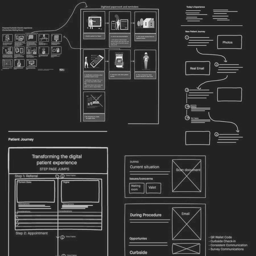
Digital Patient Journey
Defined a strategy to improve the patient experience before,
during and after a procedure. This experience was designed to
improve communication and reduce contact during patient
visits.
Problem: The patient experience was directed
by several different entities and communication was a
non-personalized mixture of electronic mail and paper mail.
Challenge: Navigating the many teams
involved. Establishing a strategy with feasibility.
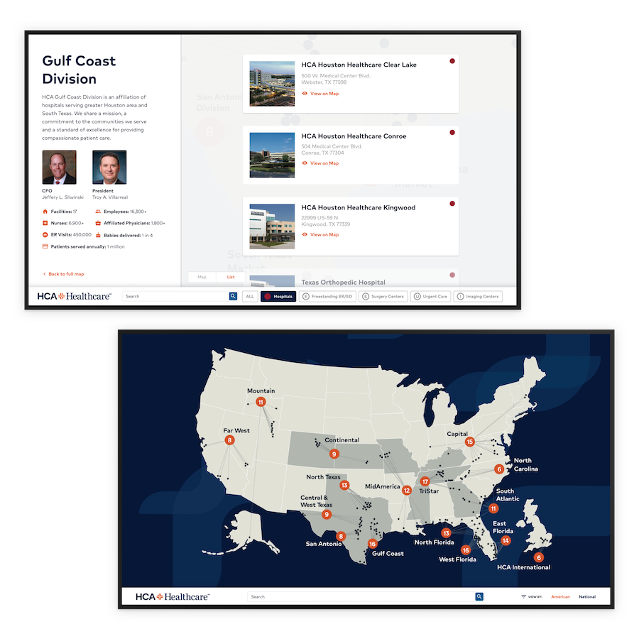
TV App Design
Executive TV App
C-Suite TV application employed to explore the vast HCA
Healthcare divisions across America and the UK. With this
application, visitors can visually search by facility,
division, market or location right at their finger tips -
literally!
Challenges: Physical ergonomics, monitor size
and user distance, touch radius and height, facility
organization, app way-finding.
UX Design
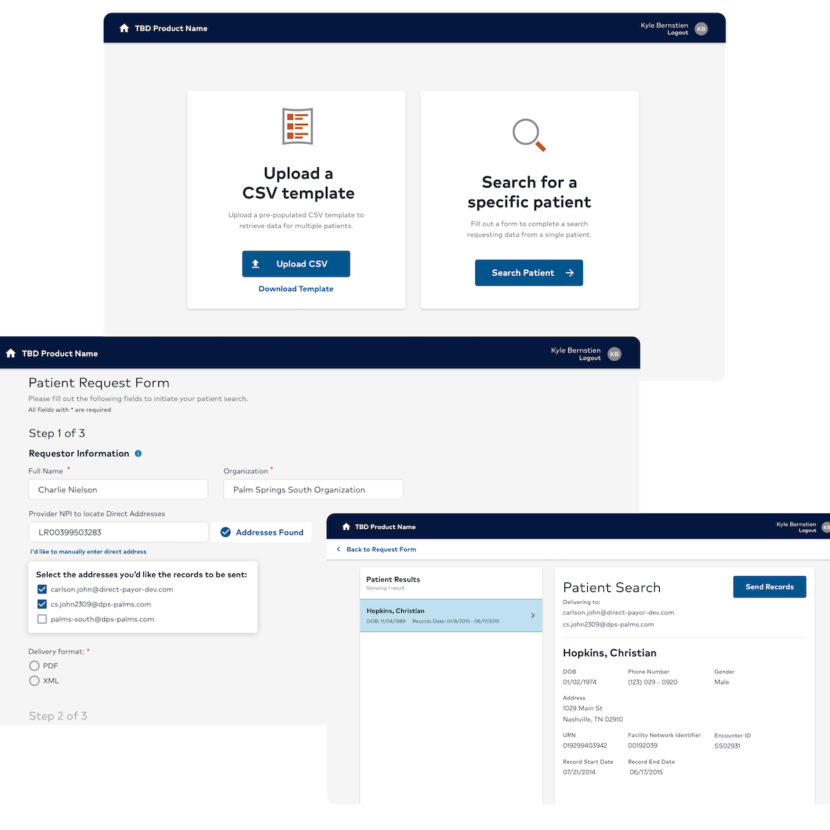
21st Century Cures
21CC is a web-based application that streamlines the patient record hand-off between authorized medical staff. I led, researched, designed and aided in the development of this project.
Problem: Patient record hand-off was a cumbersome, disjointed process. It often
took longer than required and experienced communication inconveniences.
Product Solution: After defining the user flow, I was able to trim down the process into linear paths. While leveraging visual design to avoid
unnecessary cognitive overload, the team and I worked together to ensure all requirements were met and test the designs to create a beneficial solution.
UX Design
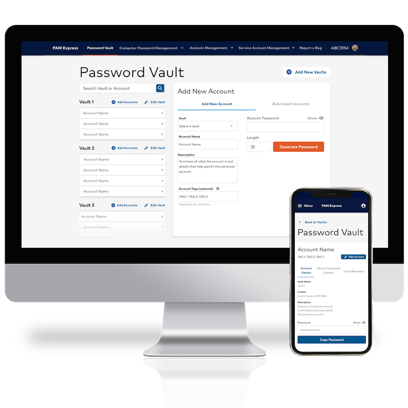
PAM Express
Allows for creating & storing group and individual passwords
in a secure, company-moderated environment.
Problem: Passwords were being kept in 3rd
party apps with no regulation or security.
Challenge: Design an in-house intuitive and
familiar application to detour employees from using 3rd party
applications. Deliver a viable MVP to the development team
comprised of exactly one developer.
Research Study
Optimizing Data Tables
Intensive usability research to identify optimal data table
design patterns for efficiency, consistency and legibility.
Problem: Table design debates were argued
with objective claims and the Neutron design system needed a
credible explanation for table components and patterns.
Research Methods: A/B testing, think aloud
protocols, ethnographic screen tracking, timed task analyses
for both desktop patterns and complex data-handling on mobile.
Neutron Design System
Defining Dark Mode
Crafted a dark mode to compliment Neutron's design system
palette.
Problem: Developers were turning towards
their own style of dark modes and our native kits (iOS &
Android) required a dark mode experience.
Challenges: Maintaining accessibility,
staying within brand, one to one color conversions and dealing
with atypical color combinations.